I started off trying to find flags which could be customised to put your logo on the equipment and found that the only real design aspect was the logo and a running theme with the jerseys of these particular teams.
 |
| Found via Google: http://www.nhlflags.com/ |
 |
| Found via Google: http://www.nhlflags.com/ |
These two flags are of the Pittsburgh Penguins and the Philadelphia Flyers. The shapes used are a representation of the kit they wear. Pittsburgh (top image) has quite a modern and stylish design which differs slightly from the Philadelphia team's kit
 |
| Found via Google: http://bleacherreport.com/articles/504496-pittsburgh-penguins-defensemen-kris-letang-alex-goligoski-taking-center-stage |
 |
| Found via Google: http://www3.pictures.gi.zimbio.com/Pittsburgh+Penguins+v+Philadelphia+Flyers+BXGu7s3gSucl.jpg |
As you can see the Philadelphia Flyer's kit is a lot more traditional and uses a sports strip theme whereas the Pittsburgh kit is a bit more modern and stylish. So these reflect the design on the flags. So you can see the Penguins have a more modern approach and fits around the logo design where the Philadelphia design matches the sports stripes.
Moving on from this I came across these things:
 |
| Found via Google: http://www.usimprints.com/store/category/promotional-outdoor-flags/ |
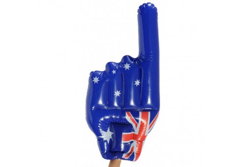 |
| Found via Google: http://www.getkooky.com.au/giant-hand-inflatable-australian-flag |
These are inflatable flags/merchandise and I think they are a good idea for this aspect as it's cheap, lightweight and fun. The audience can have lots of fun with these things as they can fit on your hand like a glove so you don't have to worry about holding it all the time. If it's thrown it won't hurt anyone and it's also child-friendly.
But these designs are just the same as the top flags, it's just pretty much the logo and a name.
Onto my designs again I didn't really do any sketches as I knew the designs were going to be really simple and heavy use of the logo which is a drag and drop job.
I wanted to incorporate features of my kit and try to accomodate the shape of the logo into the shapes which will help make the design a little more interesting and cool looking. I think to make it look cool is a key aspect because sports fans love that sort of thing, they love things that look 'epic' and bold.
Here are my designs and the notes on the screenshots will explain everything about that particular design:


My final outcome:

I chose this one because I thought it had the most outstanding features and the white made the information appear more readable. Also I think the white is a good distraction from too much blue or too much gold as it can be a little overwhelming.
I struggled with this aspect simply because there was no research out there to inspire me even though the design is really simple. I also didn't really learn anything from it which was a disappointment but I've learned a lot from the other aspects from this project so I don't feel at a loss!
The next thing I need to do and the last thing is the Bus Advertisement.
No comments:
Post a Comment