Anyway onto my research. For the billboard I needed to design something that would be realistic and not too expensive. A lot of pictures I found were really extravagant and creative or really standard and boring. However there were a few images which gave me a few ideas on what I could do which were interesting and not too crazy. Obviously for the billboard I had to think about the fact that people are only going to see this advertisement for maybe a few seconds as they drive past it so I need to achieve a look which stands out, simple and straight to the point. I should really only use limited text but the most important pieces of information should stand out.
The first billboard that I pointed out was a snowboarding advertisement:
 |
| Found via Google. Number 29 in this list: http://www.demilked.com/40-creative-billboard-advertisements/ |
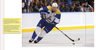
This idea I thought was really creative as it looks like a real life person snowboarding. Even the billboard itself has a slope. This basically sparked an idea where I could have the ice hockey player coming out of the billboard. This would attract a lot of attention by itself and would be reasonably inexpensive I think as it's just an extra piece of board/print and cutting expense. It would represent an ice hockey team coming to a town near you where you can watch a live game that's in your face. Much better than watching it on tv where it is 2D and on a screen.
This straight away was an eye opener into what I could do.
Another research piece I found was of a ESPN billboard:
 |
| Found via Google: http://barbariangroup.com/posts/1045-espn_quot_astroturf_quot_ads_stolen |
Now this design has astroturf on the board replicating grass but I couldn't really find a way of replicating ice as it just looks glossy and shiny. The problem with that is when people drive past and the sun is shining, that billboard will really cause a problem with the glare directing into people's eyes constantly. Not only dangerous but very annoying!
But I still liked the concept of having part of a football pitch as a teaser and a catchy line to grab people's attention and curiosity. Ice Hockey rinks are quite distinctive anyway so I think that could work well.
The next picture I found was of another ESPN ad but this time a little bit more standard:
 |
| Found via Google: http://nichez.com/nichez-project-92_espn-billboard-design.html |
This design is a little more standard and not very different but I still like it. Sometimes an existing and samey approach is the best way for something. A billboard is a classic example of this because it needs to be simple and to the point, if you try to overcomplicate it then people will go straight past it and wonder what it was.
So this design has a football player in an action stance with the ball, obviously this is automatically going to attract the sports fans and guys attention straight away as the tone of the design is quite masculine. The burly football player, bold fonts, red and black colour signifying danger and action.
The tabs coming off the player and lay underneath the text is a good technique to get something to stand out and be noticed. Without the red and black bard then I think the typography would struggle on the background. I also like how they have made a diagonal shape running along the billboard which helps the logo to stand out, it somehow brings out the red in the rest of the billboard I think.
Now my designs have been inspired by these, using different aspects and doing my own take on them.
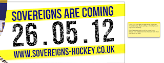
Here they are and the explanations are in the screen shots:
 |
| Site used: http://www.clearchannel.co.uk/useful-stuff/billboard-poster-sizes |
 |
| Tutorial used: http://photoshopcontest.com/tutorials/22/making-snow.html |
Overall I tried a few variations with a limited amount of ideas. The research I gathered was good but it's difficult to try and be creative with something that's already quite costly and because so many existing examples are just very simple so I found it difficult trying to experiment with different things for this billboard. Saying this though I still can't choose between the player billboard or the puck on the ice board as I like them both. It's late and I'm going to sleep soon so I will sleep on it and on my next post I say which one I want to use.
I feel like I've learned quite a bit from this though. The tutorial I used helped me to learn more about the blur tool and the pixelation method which I've never done before. Also I googled techniques about good billboard design techniques and came across stuff like this:
http://naldzgraphics.net/tips/effective-tips-on-how-to-design-billboard-advertisements/
So I have learned about billboard design. Most of the techniques were just common sense but a few things like how important simplicity is for billboards whilst delivering the message effectively. I did feel challenged by this aspect of the project but it's another piece of design that I've never properly done before so it was good to learn it I think.
I only have the flag and the bus ad next to do. And I think I will go for the flag as I want to try and be creative with that starting tomorrow.


No comments:
Post a Comment