Wednesday 16 May 2012

Final Evaluation.

This project I have certainly enjoyed my time doing something that I feel passionate about which in result gave me pleasure to be working on it.
For my brief I had to design a Logo, Kit design, Flyer, Press Release, Flag/merchandise, Billboard and Bus Ad.
I do feel like I've gained quite a bit from this project and I'm glad I did it but at the same time I'm disappointment with some of it.
I learned how to use some new effects in Photoshop such as the pixelate tool which I've never used until now, I've learned the different styles that there can be with sport design such as styles of different approaches you can take with logos and kit designs. I've learned how to advertise effectively using billboard and bus ads (most of the it was common sense but now I feel confident to design another one without worrying how to make it effective), I've learned how to design for a press release and the many forms it can take. I've learned how to change a person's clothes/kit on a large scale through Photoshop and in addition to this I started using CS5 instead of CS4 and I'm feeling comfortable with it now.

Admittedly I should have picked some better concepts I think. For example I should have only done the billboard or bus ad as they are basically the same thing only on a different setting. However I have learned from this and will bear it in mind for future projects. Also I am not particularly impressed with my advertisement as I had to use the same photo on everything. I caught my photography a game before the premiership final and didn't edit my pictures until that next week so I didn't have the chance to get more photography due to no access to any Ice Hockey games. Their next game is in September, which wasn't helpful! However I have definitely learned from this and will act early on to get my sources just in case they may be flawed. So I think overall my advertisement failed in the photographic aspect of things but I still think I executed the messages well in my work. In addition to this I feel that the lack of photography limited me of doing something different and unique.
I also found it difficult sticking to a plan as some aspects took a lot longer than most and I was being quite precious about the logo and kit. I think choosing something quite personal to me had that effect on me as I love the logo and kit designs in Ice Hockey.
I think I have gotten a little better at showing people my work and receiving feedback but I'm still a little reserved, I think sorting this issue out is a priority for me in the future as most designers need input from other designers for a good final outcome.
So although there have been some quite big flaws in this project I still feel that I've learned a lot from it and has given me the opportunity to do something that I love.

So here are the final outcomes:


Logo:


Kit:


Flyer:


Press Release:


Merchandise:
Billboard:


Bus Ad:


So that is my project over and thanks for reading/viewing!

Special thanks to:
Alex Gamble
Matt Cartmell
Tim Bones
Sancha De Burca
Colin Watson
Lauren Martin
Laurene Pineau
My family and friends at home.

Tuesday 15 May 2012

Bus Advertisement research and designs.

I've now completed my bus advertisement and as the same as the inflatable hand merchandise this was a little extra that I thought would be nice to put in. It was going to be basically the same as my billboard designs only on a bus as I needed to keep it consistent. That was when people see the the billboard and bus advertisement they can relate to it the same.
The research I could find were either really basic or totally different. For example most ads you see are of new films coming out and are in the standard 'T' design space along the bus like this:

Own photography
I wanted to do something a little similar and have a mix between an oversized print and whilst still using the 'T' design space as I didn't have the correct photography for anything creative. (If I did then I'd probably do something wear an Ice Hockey player would be taking a shot from a far and the puck would be played by the wheel of the bus).

Types I billboards I found were like above designs where the main image of typically a character/person would be within the descender of the 'T' shape as it's long and has the space which allows a body to the presented. The rest of the ad is filled with text and a background which relates to the subject genre. Other designs that I found were like these:

Found via Google: http://www.springsgov.com/Page.aspx?NavID=3735

This is an ad which I thought stood out to me simply because the ice hockey player is the most dominant piece of imagery there. This is very simple but I think it needs some text to accomodate this picture. Only images that are clear and very well renowned that get away with just an image as everyone would know what it was and what it's about.
Bus advertisements are very similar to billboards, you need to keep it simple with the most important information in a small design space as people will only read it for around a few seconds.
The image above obviously just tells the public that the image refers to Ice Hockey and is advertising the team. Although no text makes me think it's just a symbol of love for local Ice Hockey maybe.

I found that I didn't really need much research for this as I've come to learn that's it's basically exactly the same as the billboard only on a vehicle and on a different different design space. And again because of this I didn't do any sketches as it would have wasted time for me as I knew what I had to do.

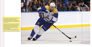
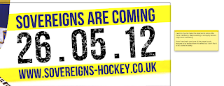
These are my designs, the notes on the screenshots explain my reasoning for what I did:


Final thing:


I felt I didn't really learn a lot from this but the fact that I basically redid the billboard aspect only on a bus as that's just the nature of the bus advertisement. Although I do like the way the player is appearing just out of the design space as it stands out and catches the public's eye, which is the main thing it's meant to do so I think even though I've copied the billboard it's still done what it has to do.

I've now done all the work I need to do and now need to print, which I will do tomorrow at college. Mount everything and then hand in! Next thing I need to do though is my final evaluation for this project but I'll do that after I've printed everything and mounted my work.

Sunday 13 May 2012

Flag/merchandise research and designs.

This aspect of the project isn't really a major part of the project but something I just wanted to do because it's simply a piece of merchandise and it's different from designing on a square design space like a billboard. I knew that the research would be minimum and the existing designs would be very simple and stagnant. When I got to my research I found this to be true as the research I found really didn't help me that much and because of the lack of inspiration out there for this kind of thing it was very hard to develop it in a way which is 'different'. This was ok though as I only really considered this piece as an 'extra'.

I started off trying to find flags which could be customised to put your logo on the equipment and found that the only real design aspect was the logo and a running theme with the jerseys of these particular teams.

Found via Google: http://www.nhlflags.com/


Found via Google: http://www.nhlflags.com/


These two flags are of the Pittsburgh Penguins and the Philadelphia Flyers. The shapes used are a representation of the kit they wear. Pittsburgh (top image) has quite a modern and stylish design which differs slightly from the Philadelphia team's kit


Found via Google: http://bleacherreport.com/articles/504496-pittsburgh-penguins-defensemen-kris-letang-alex-goligoski-taking-center-stage

Found via Google: http://www3.pictures.gi.zimbio.com/Pittsburgh+Penguins+v+Philadelphia+Flyers+BXGu7s3gSucl.jpg

As you can see the Philadelphia Flyer's kit is a lot more traditional and uses a sports strip theme whereas the Pittsburgh kit is a bit more modern and stylish. So these reflect the design on the flags. So you can see the Penguins have a more modern approach and fits around the logo design where the Philadelphia design matches the sports stripes.

Moving on from this I came across these things:

Found via Google: http://www.usimprints.com/store/category/promotional-outdoor-flags/

Found via Google: http://www.getkooky.com.au/giant-hand-inflatable-australian-flag


These are inflatable flags/merchandise and I think they are a good idea for this aspect as it's cheap, lightweight and fun. The audience can have lots of fun with these things as they can fit on your hand like a glove so you don't have to worry about holding it all the time. If it's thrown it won't hurt anyone and it's also child-friendly.
But these designs are just the same as the top flags, it's just pretty much the logo and a name.

Onto my designs again I didn't really do any sketches as I knew the designs were going to be really simple and heavy use of the logo which is a drag and drop job.
I wanted to incorporate features of my kit and try to accomodate the shape of the logo into the shapes which will help make the design a little more interesting and cool looking. I think to make it look cool is a key aspect because sports fans love that sort of thing, they love things that look 'epic' and bold.
Here are my designs and the notes on the screenshots will explain everything about that particular design:


Because there wasn't much to go on the simple nature of the product I had limited ideas to experiment on but I tried to use the research features I found.
My final outcome:


I chose this one because I thought it had the most outstanding features and the white made the information appear more readable. Also I think the white is a good distraction from too much blue or too much gold as it can be a little overwhelming.

I struggled with this aspect simply because there was no research out there to inspire me even though the design is really simple. I also didn't really learn anything from it which was a disappointment but I've learned a lot from the other aspects from this project so I don't feel at a loss!

The next thing I need to do and the last thing is the Bus Advertisement.

Saturday 12 May 2012

Billboard research and designs.

For my billboard I have done some designs that I think are suitable for my project. I will go through my research first and then post about my designs. I haven't done any sketches for this aspect simply because I don't think there was much point in doing it. Not because I didn't want to do them or didn't want to make the effort but it's simply because the billboard's going to be 80/90% photography anyway as it needs to simple. So placing a photograph and arranging some text and making a few shapes is a lot more efficient and faster doing it on screen instead of having to sketch everything out. Whereas for a press release or logo then the sketches would be beneficial and time saving.

Anyway onto my research. For the billboard I needed to design something that would be realistic and not too expensive. A lot of pictures I found were really extravagant and creative or really standard and boring. However there were a few images which gave me a few ideas on what I could do which were interesting and not too crazy. Obviously for the billboard I had to think about the fact that people are only going to see this advertisement for maybe a few seconds as they drive past it so I need to achieve a look which stands out, simple and straight to the point. I should really only use limited text but the most important pieces of information should stand out.

The first billboard that I pointed out was a snowboarding advertisement:

Found via Google. Number 29 in this list: http://www.demilked.com/40-creative-billboard-advertisements/
This idea I thought was really creative as it looks like a real life person snowboarding. Even the billboard itself has a slope. This basically sparked an idea where I could have the ice hockey player coming out of the billboard. This would attract a lot of attention by itself and would be reasonably inexpensive I think as it's just an extra piece of board/print and cutting expense. It would represent an ice hockey team coming to a town near you where you can watch a live game that's in your face. Much better than watching it on tv where it is 2D and on a screen.
This straight away was an eye opener into what I could do.

Another research piece I found was of a ESPN billboard:

Found via Google: http://barbariangroup.com/posts/1045-espn_quot_astroturf_quot_ads_stolen

Now this design has astroturf on the board replicating grass but I couldn't really find a way of replicating ice as it just looks glossy and shiny. The problem with that is when people drive past and the sun is shining, that billboard will really cause a problem with the glare directing into people's eyes constantly. Not only dangerous but very annoying!
But I still liked the concept of having part of a football pitch as a teaser and a catchy line to grab people's attention and curiosity. Ice Hockey rinks are quite distinctive anyway so I think that could work well.

The next picture I found was of another ESPN ad but this time a little bit more standard:

Found via Google: http://nichez.com/nichez-project-92_espn-billboard-design.html

This design is a little more standard and not very different but I still like it. Sometimes an existing and samey approach is the best way for something. A billboard is a classic example of this because it needs to be simple and to the point, if you try to overcomplicate it then people will go straight past it and wonder what it was.
So this design has a football player in an action stance with the ball, obviously this is automatically going to attract the sports fans and guys attention straight away as the tone of the design is quite masculine. The burly football player, bold fonts, red and black colour signifying danger and action.
The tabs coming off the player and lay underneath the text is a good technique to get something to stand out and be noticed. Without the red and black bard then I think the typography would struggle on the background. I also like how they have made a diagonal shape running along the billboard which helps the logo to stand out, it somehow brings out the red in the rest of the billboard I think.

Now my designs have been inspired by these, using different aspects and doing my own take on them.
Here they are and the explanations are in the screen shots:

Site used: http://www.clearchannel.co.uk/useful-stuff/billboard-poster-sizes


Tutorial used: http://photoshopcontest.com/tutorials/22/making-snow.html


Overall I tried a few variations with a limited amount of ideas. The research I gathered was good but it's difficult to try and be creative with something that's already quite costly and because so many existing examples are just very simple so I found it difficult trying to experiment with different things for this billboard. Saying this though I still can't choose between the player billboard or the puck on the ice board as I like them both. It's late and I'm going to sleep soon so I will sleep on it and on my next post I say which one I want to use.

I feel like I've learned quite a bit from this though. The tutorial I used helped me to learn more about the blur tool and the pixelation method which I've never done before. Also I googled techniques about good billboard design techniques and came across stuff like this:

http://naldzgraphics.net/tips/effective-tips-on-how-to-design-billboard-advertisements/

So I have learned about billboard design. Most of the techniques were just common sense but a few things like how important simplicity is for billboards whilst delivering the message effectively. I did feel challenged by this aspect of the project but it's another piece of design that I've never properly done before so it was good to learn it I think.

I only have the flag and the bus ad next to do. And I think I will go for the flag as I want to try and be creative with that starting tomorrow.