Monday 30 April 2012

Logo testing.

Recently I made an account on the International Hockey forums (http://forums.internationalhockey.net/index.php) and posted my logo on the site (thread is here: http://forums.internationalhockey.net/showthread.php?11539-Ice-Hockey-University-Project) to test my logo and see if it bolds well with my target audience.
I needed to know what message they receive from the imagery and colours. Overall I got a good response from those who replied and they explained to me that they got the regal look and hockey theme from the logo. In result I have proven my logo to be successful but there was an issue that almost everyone had and that was the shading on the left side of the imagery, they said it was too dark and a little awkward on the stick/shield which I can understand. Therefore I made a few adjustments and posted some screenshots of some different versions. Here is the conversation so far:


I tried to change their mind about scrapping the shading and showed them a version without it to prove how flat it looks but I also added a few others with a lighter gold which turned out a bit better and the last reply seemed to agree with that one. The only problem with this is that because the shading is lighter is might mean it'd get lost a little when scaled down. But when I scaled it down I found that 'Sovereigns' was in fact a little easier to read than the darker shaded examples, in addition I don't find the shading to be a priority and is not an important piece of information to take in therefore it wouldn't matter too much if it did get lost a little. The main point of it is to make it less flat and for the logo to pop out a little more which it still does manage to achieve. Therefore I think I will stick with that version.

Also here is my reasoning for these decisions:


Sunday 29 April 2012

Flyer research.

The next step for me is to move onto something else whilst my kit is in the process of being looked at.
I want to move on to flyers therefore I have done some research into what I think would look good as an Ice Hockey advertisement.
Ideally these flyers would be handed out by the team/friends/family/around town (everywhere basically!) and therefore really need to focus on selling the team and game. For this I need to involve information regarding the team's practise sessions, prices, times, games etc. I want make sure I catch people's eye with this as it is one of the most valuable pieces of advertisement I would be able to afford.

Another thing worth mentioning is the printing. I would have to consider the fact that semi-gloss will be the best option. Reasons being is that a matte surface tends to make scratch marks very easily and because flyers are designed to fit in pockets/bags without any protection, therefore they would get ruined quite easily. I could use Gloss paper because it looks most like the surface of ice but then again if these flyers are to be held everywhere then I have to consider light glare reflecting off the flyer and putting people off reading it. If I use a semi gloss paper type then I still have the icy feel and look but without the glare and limited scratch marks. Semi-gloss isn't the most durable out of the 3 but flyers are naturally always going to crease/tear somehow just due to people fidgeting with them.

The research I have gathered is quite photographic (I have photos from a Guildford Flames game) and so I will be involving my own photography into the designs. Before I start designing on screen however I need to make sure I have settled on a kit design (still waiting on feedback) because I'll need to photoshop the kit to look like my designs.

This first piece I collected I chose simply because I really love the composition of how the bike and rider are slanted slightly and the text reflect that in the same way. Because Ice Hockey players move fast they require having to twist and turn in different angles all the time and so this might be a nice effect to use. It would reflect the movement and agility of the game. In addition to this I quite like the black and white imagery with a singular piece of orange text and strip make it really stand out. So for example I could have a price or special offer in a solid colour whilst everything else is grayscale. Just a thought.


Found via Google: http://megadeluxe.com/wp-content/uploads/2012/01/jegou-05.jpg

I found this one and reminded me of the banner effect I have on my logo which I can reuse in this style. I have used this effect in other designs but this will keep the design consistent, fashionable and modern which will result in more young people feeling encouraged to find out more about it.
When I looked closer I also saw that the banners had a sort of grungy splatter effect I think to reflect the gritty and dirty nature of biking. I could have a similar effect here but maybe ice skating indents.

Found via Google: http://www.makebetterflyers.com/flyers/mega-bmx-show/

I chose this design because of the typical action orientated appeal that it projects. Here we have a player obviously looking like he's celebrating from a goal. if you notice the player is slanted to the right slightly and so the text is doing the same which reflects a good composition and consistency.
I really like the use of different sizes for the text and the biggest sized word is 'IGNITE' which is already a heavy word and creates a lot of impact which I think does well in catching peoples attention.
Just while writing this I realised that the blue light looks like the same spot as where the basketball hoop would be, I think the light reflects the fact this player has just scored a goal and looks like some sort of 'magic' is coming out from it which plays along with the team's name which I quite like. Quite often sports commentators mention the word magic when something extraordinary/skillful just happened.
I definitely think using action shots are a great way of promoting a sport which is fast and physical.
Additionally I like the line going through the word 'IGNITE' as it looks similar to ice which has just been skated over.

Found via Dribbble: http://dribbble.com/shots/531321-Tourism-Flyer

Moving onto something with a little more 'grit' I chose this one because I quite liked the use of cropping a photo to see just the legs as I think it creates a lot of movement which would encourage fellow athletes and sports fans to take interest in. The same thing could be applied with ice hockey players legs and skates. It will instantly tell the public that the game is fast and intense. Although I do think it's important to involve the entire body but I found this quite enigmatic. I want people to feel encouraged to check out the team but at the same time feel curious about the game. Ice Hockey isn't a very renowned sport here but I know American Football is becoming more popular now and I think if more people became more aware of Ice Hockey they would really enjoy the game (football fans and ice hockey fans aren't that different).
I quite like the grit shown on the inside of the photo as it represents the mud and dirt you move through when running and so I thought that could be a nice touch (similar to the banner shape on the 2nd flyer in this post).

Found via Google: http://www.hogensondesign.com/2012/03/esp-flyer-designs/

This is one of the only few Ice Hockey flyers I saw that I actually liked and so I thought I'd put it in my research. I liked this one for its composition and gritty nature shown in the text. It's as if the text is printed/embedded into the ice which gives a really nice effect I thought. I have pictures of the ice rink in Guildford as a whole and so it is a good design space for large text.
I tend to take interest in text based designs as they say exactly what is needed to be said without having a meaning hiding behind an image and this does just that and so I think maybe this could be used in the same way to promote the team and game. I'm sure other people feel the same about other ads which are heavily text based.

Found via Google: http://www.periscope.com/Work/view/168/Cross-Ice/947/

I thought I wanted to include this piece because of the shape. Bearing in mind this is a banner and not a flyer but I thought this could work just as well as a flyer. The shape suggests a sport to me so without registering the imagery straight off I think the shape gives away the concept anyway which I found to be quite interesting. Also the same shape is used in my logo so this would keep the design consistent throughout. This would catch the eye of other athletes and sports fans as they would recognise the shape from other sports.

Found via Google: http://shop.mlb.com/product/index.jsp?productId=12364745

The blue lines in this one stood out to me because it looks like the ice skate indents on ice and so I thought that could be a nice touch. However it does also look like what it's originally advertising, snowboard marks. But also what I got from this are F1 tracks or racing tracks in general because quite often they have tracks which adopt a very similar shape.
Also again with the simple colour palette with one solid colour standing out. I find it really effective. Although I think this could be better if 'Snowboard' was in blue and it would immediately tell people it's a snowboard event not a race car event.

Found via Google: http://www.presidiacreative.com/28-inspirational-flyer-designs/

This last design I wanted to use because of the composition of shapes and angles. I think it's really effective because it looks modern, signifies the snowboard shape from the curved corners of the boxes and also the text are angled similarly to the dexterity and flips of the extreme sport. I also think the editing of the photography here is really nice as it looks action packed, exciting and fun. Which is definitely a selling point for such an extreme sport and of course the same for Ice Hockey so this idea might be a good idea to take forward. I think the public will recognise an action packed flyer and take interest better than they would take interest in a normal flyer. I really need to focus on making my designs powerful and exciting.

Found via Google: http://www.stocklayouts.com/images/Blog/ski-snowboard-instructor-marketing-graphic-design.jpg

Overall I think this research has given me a ground for ideas and I feel like I can try lots of different things whilst staying consistent with my original designs.

The next step for me now is to get to sketching and I will post any more inspiration if I find any.

Saturday 28 April 2012

Kit designs.

So far I have come up with some designs that I have made using Adobe Illustrator. I experimented a little bit and tried to think outside of the box to create some shapes that look aesthetically pleasing and that stay true to the original design on the Ice Hockey kits.
I needed to think up of something simple so it's not too complicated. This is especially important because people will need to see the kit's information clearly as the players move very fast and so it's difficult enough to see who's who. In addition to this I wanted it to look modern and sophisticated, that way the team will feel professional and brand new which will increase their morale and heighten their performance and also the opposing team will recognise that and feel threatened/intimidated.

Here are some of my designs so far:


I like what I have done already but I think the next step would be to get some feedback from my peers and see what they have to say as it's always helpful.

Monday 23 April 2012

Kit design sketches.

I have thought up of some design sketches for my kit design and so far they are looking good I think. When they are on screen I plan to experiment with the designs I choose to mock up.
I have annotated the designs by hand because I wanted to make sure my thoughts were noted just as I thought up of the design. If I left it and typed it up afterwards I would have forgotten certain parts about the design reasoning.

I traced around some existing pieces of equipment found via the internet, the sources can be found here:


  • Helmet: http://www.icehockeyworld.com/products/Reebok-4k-Senior-Hockey-Helmets-.html
  • Goalie Helmet: http://www.icehockeyworld.com/products/Vaughn-VM-9500-PC-Senior-Goalie-Mask.html
  • Jersey - template used from the Boston Bruins template: http://puckdrawn.typepad.com/puckdrawn/2009/02/hockey-jersey-concept-templates.html
  • Gloves: http://www.impactskates.co.uk/shop/warrior-burn-ice-hockey-gloves/prod_607.html
  • Shorts: http://www.icehockeyworld.com/products/Warrior-bonafide-junior-hockey-pants.html
  • Socks: http://www.puckstop.com/acatalog/nhl_sanjose_socks_resize.jpg
I simply used the pen tool around these pieces of equipment to give me a rough idea of the shape of the item.


Here are my sketches:

1.


2.


3.


4.


5.


6.

Goalie leg pads, blockers and catcher gloves customisation.

For the goalie kit I found that you can only really 'customise' the same pieces of equipment as the other players. So the helmet, shirt, jersey, gloves and socks.
The goalie pads, blocker and catcher have specific patterns (different makes and models will have different patterns) and you can have the option to colour the main body of the equipment and another colour for the different patterns, as such:

This model is the the Reebok P4 gear. I have coloured each part differently to show what bits you're able to change:


All of the above was taken from the customiser provided by Reebok via http://www.reebokhockey.com/corpo/p4-goalie/customizer.html

I'm showing this to prove that I don't see the point in doing the sketches because I won't be 'designing' the patterns as such but only changing the colours. Therefore to save time I will use this customiser to guide me in the right direction as to what colour combinations/placements work best.

Sunday 15 April 2012

Kit research continued.

I have confirmed with my tutors that designing the full kit will be a good idea as it will look good in my portfolio and the kit will look complete.
I have decided what I am going to design:
  • Helmet
  • Jersey
  • Gloves
  • Shorts
  • Socks
Everything else is either underneath the jersey/shorts/socks etc that it doesn't need to be customised and professional teams only have the above list customised/colour coded.

I have already covered some of the full kit research in my previous post but I just wanted to prove how little and basic the designs are for the short/helmet/socks etc.
I'll take my favourite team for this instance, the Pittsburgh Penguins.

Picture found via Google: http://www.thestarphoenix.com/sports/Hartnell+Flyers+Pens+streak/6321943/story.html

Picture found via: http://penshead.com/2010/01/19/pittsburgh-penguins-team-and-uniform-through-time/

Found via Google: http://sports.nationalpost.com/2012/04/11/for-sidney-crosby-playoffs-will-be-telling/

As you can see from the above pictures that everything is very basic, maybe a few shapes on the shorts, gloves and socks. The most creative part of this kit is the jersey which isn't so much 'creative' but a template telling you what the team is and who the player is which is possibly the most important thing a kit needs to do, which I need to project.

The shorts are very basic. They include a stripe running down either side featuring a gold and white strip which simply tries to keep the design consistent throughout. Also the logo and sponsor is sported on the front of the attire making them part of the uniform.

The same with the gloves but this time the only thing that the design shows is the brand of the gloves and a few gold stripes telling you it's part of the uniform again. Something that I missed earlier when I first saw the 3rd picture is that there is a small printed '87 - Penguins' printed on the top of Crosby's gloves. This tells him they are his in case it gets mixed up with anyone else's gear/lost in general. I thought this was quite tactical because quite often they are misplaced both on the ice and off. I say this because sometimes when a fight starts, the players throw off their gloves and fight but sometimes more than a few players get involved and when it comes to trying to collect their gloves they can tell whose is their's from the number - in this case, 87.

The helmet shows the logo on either side of the helmet scaled down quite a bit and the number of the player both on the front of the helmet and back. Also again the brand is printed on the crown of the helmet. I found this to be a good design method because, like the gloves they can be easily misplaced on the ice when a player gets into a fight/knocked down and again it will tell the player whose is whose from the print in the locker room but it still looks presentable and well designed in order to give that professional and uniform look.

The socks don't need a number or name because they are just socks, they are cheap and doesn't matter too much if they are misplaced. Also I think too many numbers and logos scattered over the kit will make it look too complicated and cramped. The only design method I can see here is a colour consistency which makes it part of the uniform.


Found via Google: http://espn.go.com/nhl/playoffs/2010/matchup/_/teams/capitals-canadiens

I have covered most of the design practises of the ice hockey kit but I just wanted to involve another team - Washington Capitols.
The same techniques apply to this kit's design also where everything matches the jersey colour wise.

The socks are slightly different here as the stripes are a slightly different proportion. I think because red is such an intimidating and classic 'danger' colour that they tried to implement it as much as possible but not too much to overwhelm the design.

The shorts appear all blue I think to try and make the jersey really stand out. If there was any more red on the shorts then I think the jersey wouldn't pop out a much and the same as the socks.

I've learned quite a few things about these few kit designs. For example how important it is to be consistent with the colour co-ordination, strategic placement of specific information (names, numbers etc). Most of all though just how important the uniform is to the team. The consistent colours, placement of information and shapes are what make the uniform and it looks really intimidating to see your opponent with a classy uniform where everyone looks the same and 'as one' which makes them really look professional.

Saturday 14 April 2012

Kit research continued.

An idea I had earlier was to have a look at some royal clothing that members of the Royal Family would wear. I think this could be a key asset in making the kit look original whilst looking regal. Of course there are a lot of features worn by members of the Royal Family as seen below:

Found via Google: http://www.hdwallpapersdesktop.com/Photography-Wallpapers/British-Royal/images/british-royal-family-1400x1050.jpg
I could have chosen an earlier version of the Royal Family but I think this one will be most suitable as it is up to date and modern. The Family is very famous, obviously, and therefore everything they wear will have the most traditional regal clothing that looks modern and fashionable and because I want to project a modern and stylised kit I need to follow that trend.

From this photo I can gather that there are many features available but everything together looks too clustered and so I need to choose specific parts out and test them out to see if they would fit or not.
A lot of the features already look very detailed and complicated which wouldn't work in my designs, for example the medallions, aiguillette (gold lace on right shoulder), cuffs, buttons etc.
That aside there are some features that could work, for example the blue ribbon worn across Prince William's torso could be incorporated somehow. It is quite a standalone feature and is bold which people recognise as a symbol of royalty/academia/success. I also quite like the gold neck collar as it works with the colours and stands out. Seeing as one of my main colours is gold this could work really well.
I also noticed on the trousers they wear they appear to be all black except for a red stripe down the side of the leg which stays consistent with the design of the upper body but remaining basic, formal and sophisticated. Another aspect that looks quite a lot like the traditional sport stripes pattern is the ribbon worn by Prince Harry. The stripes consist of 2 colours sandwiching the red. In addition to this the collar appears to have a 'stroked' effect in red to coincide with the rest of the clothing design.

So there may only be a few examples that could be tried out the Royal Family are some of the most famous regal figures today and therefore trying to connect to what they would wear seems appropriate and I feel like I can make a few subtle design features from this photo.

Friday 13 April 2012

Kit Design Research.


I have collated some research for kit designs for Ice Hockey, mainly looking at the professional jerseys they wear and some mock-ups by designers on www.dribbble.com. What I have found is that there is very little originality in the designs as most of the design’s main themes are sports stripes. For example the New Jersey Devils:

Found via Google: http://assets.nydailynews.com/polopoly_fs/1.414124!/img/httpImage/image.jpg
The only design techniques I can find involving these shirts are the use of colour, which relate to their logo and concept – Devils. In addition to this I have found that a lot of the teams use the traditional sports stripes wrapped around the waist area and forearm areas. I think they do this simply to pay respect to sports history.
I have also noticed how the kit designs always try and involve every colour used in the logo, so for example the Devils picture above show a red, black and white logo and the rest of the kit carries on with that same theme. I think this is used as a way to make the public identify the team very easily as the logo is used everywhere, the fans will become very familiar with it and with the same colours used on the kit it is a way to instantly tell the public who they are even without the logo in plain sight.
The logo is placed in the centre of the jersey, as it’s the most spacious part of the design and body structure so therefore it can be blown up big for people to see it easily from a distance (this is important for when seeing a game live as the players are far away from the seats further away).


Additionally what is seen on most jerseys is the team’s logo (or an additional logo) scaled down on either shoulders:

My own photography
I think what is important about this aspect is how the shoulders are one of the key most ‘stood out’ parts of the body in Ice Hockey because of the big body armour that the players wear, making it a good design space for an image. Also when the player is stood to the side that logo will act as the identifier (to someone not familiar with the team).

Found via Google: http://www.sportfansky.com/images/Mike%20Ribeiro%20Jersey%20Reebok%20Black%20Dallas%20Stars%20Premier%20Jersey.jpg

One shirt design, which stood out to me, was the Dallas Stars most recent top which doesn’t appear to have the logo on the front but only has the name ‘DALLAS’. I found this really interesting because it’s a good technique to use. Sometimes some teams can get a little confusing as to what team they are because a lot of teams have numerous colour palettes for both home and away and so it can sometimes be disorientating. With ‘DALLAS’ written clearly on the front of the shirt it is obvious which team it is. In addition to this their logo has a small design space for ‘Dallas’ but ‘Stars’ is blown up a lot bigger:

So I think they made that text on the above jersey more obvious to make up for the lettering in the logo.
Another aspect to this design which I found interesting, similar to the sports stripes, is that a lot of the old style jerseys have only text written on the front only reading diagonally downwards like so:

Found via Google: http://cdn.nhl.com/rangers/images/upload/2009/09/History_0904_combo1.jpg


This design as you can see is still sometimes used today out of respect of the old designs. I personally don’t like it however because it’s not particularly modern and doesn’t read that well. The Dallas design above though however I do like because it’s more obvious and stands out.
Again using the Dallas Stars jersey picture as a reference I’ve noticed the consistency in design on the name and number on the back, the white text and yellow stroke is used on the front and back and on the stripes to make it all one design and more like a team. The name and number is very important that it stands out because obviously people need to know who is who and what they’re doing, not only for the public though but the commentators as well.

Moving on to sponsor logos I have found that they are placed strategically on the kit in a subtle way that doesn’t distract from anything else on the design but when you see it you know who are the teams sponsors or who made/printed the kit. (This is only on the NHL shirts however, not the UK ELITE League shirts who have sponsors covering the whole design).


Both my own photography


I found that the back on the neck is a blank and large canvas and so the brands logo sits in there quite well, also the bottom of the sleeve always seem to stand out quite well because the circular shape stands out amongst the stripes making it more noticeable.

I have found some good inspiration from existing shirts that I think could help 
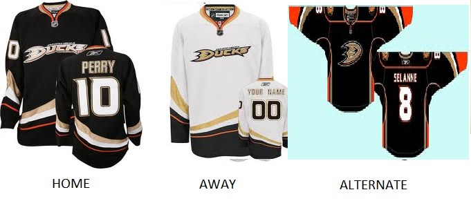
me to create a nice and functional design. I’ll start with the Anaheim Ducks most recent shirt:

Found via Google: http://www.propatchesusa.com/images/ANAHEIM%203.jpg


These designs are a bit more original than the others simply because of the shape of the stripes that appear on the shirt. You can see that the curve could symbolise the movement of players on the ice. When they turn they have to curve around in order to maintain balance and turn effectively and I think the shape on this jersey is a reflection of that. Also it’s possible that the stripes symbolise something flying through the air - say a puck. The gradual size difference makes it seem like the object flying through the air is moving forward at a very fast pace. This gives the connotation of speed and agility, which are key factors of the game.
The colours used are the original home and away colours, black and white. But I think they are dominantly used as neutral colours for both the orange and gold. The reason for orange is because of the city’s location in the Orange County, United States. The logo is in gold and so therefore they needed to introduce a gold colour into the kit design also. I think the colours used work really well and they stand out. I prefer the black version as the other colours are quite bright and therefore jump out at you a lot easier.

Found via Google: http://www.propatchesusa.com/images/wc%20blackhawks.jpg


The Chicago Blackhawks ‘Winter Classic’ (special annual match between 2 teams chosen at random) jersey I found quite interesting because it uses the same classic sports stripes but only in the centre it is enlarged fitting around the logo. With the centre of the stripe a creamy brown colour it gives the logo a chance to really stand out. I think it works really effectively and makes it easily recognisable.
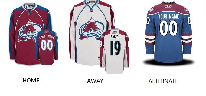
Found via Google: http://www.propatchesusa.com/images/AVALANCHE%203.jpg


The Colorado Avalanche’s shirt appears to show the home and away kit without the sports stripes, which is sitting outside the design consistency of every other team’s design which I like. But the shirt shape is also a little different as they have the seams going from the armpit to the inner neck area. I couldn’t find any logical explanation for this design but I think it could potentially give a more original look instead of having a set template that I quite like. Again the colours stand out and are consistent with the logo. I prefer the away version as the logo appears more obvious and in your face.

Found via www.dribbble.com: http://dribbble.com/shots/480159-Grand-Rapids-Griffins-Jersey-Shot-2


The Grand Rapids Griffins team is not in the NHL but rather in the AHL (American Hockey League), which is a league down from the NHL. What I found interesting about this design was the armband around the elbow area. It appears to have the logo there instead of having it on the shoulder. Also it shows the number on the side of the shirt too which I really liked. I much prefer the logo on the shoulder though because it has more space to sit on and doesn’t cramp too much when bending their arm. I think the logo and number sits too closely together and seem cramped when the rest of his arm is empty. Still a nice idea.

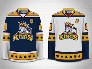
Found via www.dribbble.com: http://dribbble.com/shots/409885-Las-Vegas-Kings-shirts


I found this one again on www.dribbble.com designed by Andy Hall. I thought I could have some relevance to this design because the colours and theme are the same as mine. We have both adopted the regal look but I find his other design elements interesting. It appears he has stayed true to the sports stripes but instead he has involved the hearts, clubs and diamonds into the design. I like this concept but I think it makes the design really complicated and claustrophobic. The placement of colours though is different to those in the NHL. I feel it looks a little more original and stands out amongst the rest, which I really like.

Found via www.dribbble.com: http://dribbble.com/shots/379523-Steamrollers-Shirt-Designs


Another Andy Hall design which I really like. I think the shapes are a lot more intimidating here as he has incorporated a downward triangle (signifying offensive strategy in sport). I think the pointed look is quite scary and make you feel a little uneasy which is what you want your opponent to feel. Also he has made these shapes to stay consistent with the shape of the logos concept – steamrollers.

My own photography.

Another original jersey design is for the Dallas Stars old jersey (my old one!) You can see that the design reflects the shape of the logo making it easily identifiable and interesting. One thing I don’t like about this however is the design space for the logo in between the two points on the centre of the big star, I think it looks too cramped and forced.

I feel a lot more confident now I have some research for the jersey designs and I feel I can get to the drawing board and come up with some nice designs for my shirt. Although there have been a lot of unoriginal examples provided by the NHL I still feel like I can take it up a notch and design something that stays original to the game but looks a little different whilst staying functional.
However I still need to confirm something with my tutors about what aspects of the kit I need to provide. Because the NHL provides the kit for them who have big funds I feel that because my team is only a local team they would realistically only be able to afford the jersey and socks as a custom design, everything else will be very expensive to customise, such as the gloves, stick, shorts, body armour, shin pads, helmet, skates etc. Saying this though the NHL team’s skates, sticks, shin pads, elbow pads, body armour and gloves aren’t branded but only have a similar colour scheme, which doesn’t require customisation.

Lastly I wanted to talk about the article I found about the new GB Olympic games kit. As I read it I found some tips that will help me boost the morale of the players.
Stella McCartney, designer of the kits said that "You have to make the athletes feel like they are in the height of their performance. That they are wearing technical gear that is absolutely going to shave off the tiniest part of a second.” And that "Something that came across early on was that they want to feel and look like they are a team and there is such power in that.” 
Stella goes on to say that "When I talked to the athletes I asked them: 'Do you feel different when you look good, do you think it enhances your performance?' and they all said 'yes'.”


Article and picture from http://www.bbc.co.uk/news/uk-17457729

The next step for me now is to get to the drawing board and design!