Tuesday 27 March 2012

Ram logo sketches.

I have done some sketches for a new logo idea - some of them are quite samey as the previous ideas I had style wise but I think they work effectively. The best thing I need to do is make sure it's interesting and can connote the meanings well, in this case strength, endurance and royalty.


This first sketch is simply a crown with some ram horns attached to it. When I came up with this idea I wanted to use something which could possibly attach two things together and make it one instead of them being separate. I think this can be quite effective as a logo because it looks unrealistic and slightly enigmatic. The roughness of the horns and sharp ends would take on an aggressive look to portray the players as warriors, as for the crown it would signify the royal aspect of Tunbridge Wells.


I think this one was my favourite design out of the lot of them simply because it's a simple shape only it can be easily noted as to what it is. I wanted to try an abstract approach and this is what I came up with. I hit some inspiration from this via www.dribbble.com:

Found via Ivan Bobrov on Dribbble: http://dribbble.com/shots/167895-Ram

This design caught my eye because it was one of the rare abstract versions of designs when I searched 'Ram' into the search bar. I can see a sort of embryo shape to this design however, but as you can see by my sketch I've made a bigger head and more of a sharp style.

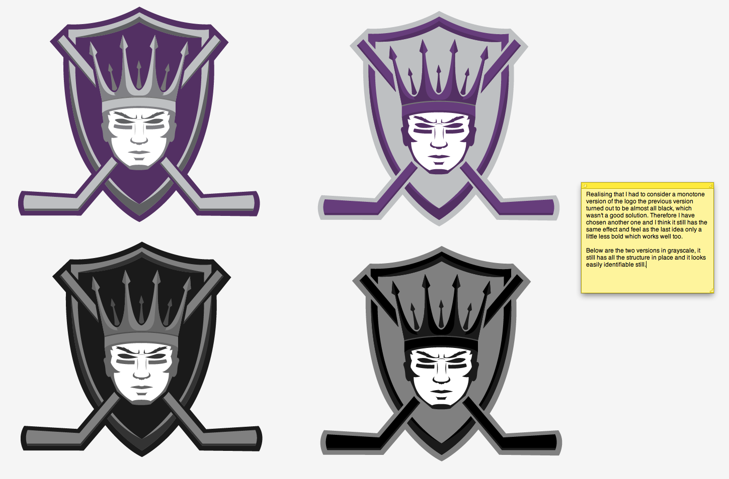
I think the crown is a nice touch and would simply be a solid colour vector shape. The design is simple enough and I think it suits staying very simple, any complicated patterns in the crown would look bad not to mention when sized down would be impossible to see therefore solid colour will be the best solution.
I think people will be able to see that it is a ram's head if they look closely and not some tad pole thing! I think when the detail comes in (gradients) then it will look more obvious.


This design is a very conventional logo as it's a straight on face of the ram's head and crown on top. This was simply inspired by the previous design for Fordham Rams that I added in the previous post. It's obvious, strong and looks intimidating, it will definitely suit the original American style artwork that I used for my Sovereigns face logo. I think the public would immediately tell what this logo connotes, that it is suggesting something strong and aggressive whilst the crown will tell them the team is royal/from a royal town/city. Definitely not a design that is 'different' as such but it gets the message across easily and effectively. I still prefer the previous sketch though as it still projects the same connotations but is a little different and original.


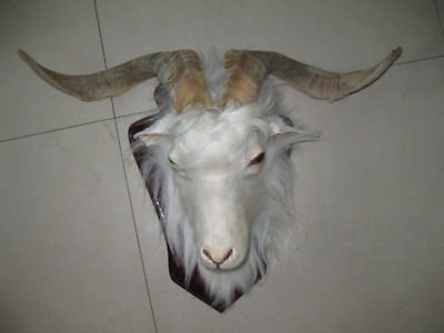
Lastly this design was inspired by the ram head on the Tunbridge Wells Coat of Arms logo which I added in the post before last. As you can see I have imitated the ram's head but added a crown on top. I like the ram facing sideways as this is always seen as a sophisticated and smart posture for anything as it looks proper and upright. The crown will represent royalty and I have added some swirls at the bottom of the logo, this is to try and represent the spring water and bring that into the design, it's not an important thing to consider but I'm just trying different things.

I think I will take up the second design and follow that on screen. I feel it is a more abstract and enigmatic approach than something that is the same as everything else. I also think it bolds well with a strong image but with a clean design, resulting in a modern yet traditional approach.

Friday 23 March 2012

Rams research.


I’m going to do some sketches to adapt to my rams head and crown idea. I need to grab some images to inspire me and give me ideas for this idea, other existing logos for example and real photos of rams.


First I had a look at some photography for rams and this is what I found:

Found via Google: http://www.sheppardsoftware.com/content/animals/images/mammals/sheep_c_ram.jpg 
Found via Google: http://kamloopsnaturalistclub.com/wp-content/uploads/2011/11/ram-with-flare-clolseup.jpg

Found via Google: http://www.fotothing.com/photos/f15/f154bffd641baf8becd4ee0957d7f2eb.jpg

Found via Google: http://mail.heat.net/store/img-large/taxidermy-animal-sheep-ram-head-dall-goat-2-different-designs_250967461143.jpg


I really like the look of the horns and I think they could be the main asset to focus on as they as very distinctive. I could easily try an abstract approach which could involve the horns in some way as they are a strange shape and pattern. I tried to get some different variations of horn shapes but the most common type are the type shown in the top image, so I think that's the best one to use to make it that much easier to identify it. It appears they can have different colours of fur which patches also in a different colour which I could play around with if it doesn't make it unnecessarily complicated.


I then went on to researching a couple of sports logos involving rams and this is what I found:


Found via Google: http://sportslogos.net/logo.php?id=2484

This logo for the Fordham Rams are a group of sports teams for the University of Fordham in New York.
I think the logo looks nice, it’s clean and bold with suitable colours. I can see from researching a bit about Fordham university that their logo is already a maroon colour so that would explain the reasons for the maroon in their sports logo. Additionally the black is a dominant colour meaning that it symbolises power as it surrounds the design and fills the shadows in the shapes.

As for the text I think they have adopted a typical athletic font, similar to the Jersey M24 font that I used for my previous face logo. This is suitable because it’s used in all sorts of athletic design, considering the university uses the same logo for all their sports team it seems suitable to use it as it fits all sport genres. I also like how they have warped the text to appear over the ram as if dominating the image which can symbolise a person/character, this appears quite intimidating. That’s easily doable in Illustrator simply by warping the text. The same technique I used for the Sovereigns type.
I want to somehow involve the spring water in the design if it would fit, in a very subtle tone. I feel the colours inside the horns are swerving, like water would - perhaps something to consider.


Found via Google: http://cdn.tripwiremagazine.com/wp-content/uploads/2011/11/image327.png

This design I think is quite nice, the blue and gold is very similar to the NHL logo for the St. Blues. Obviously this colour scheme is an important aspect of the city. I think the blue is used because the city is built right next to the Missouri River and so I think they wanted to portray the aspect of water, as for the gold I couldn’t find a meaningful reason as to why they have used that colour but it is known to run well with navy blue and therefore that’s why I think they have used it, this might be the suitable colour scheme for my logo as I want to portray a water aspect and royalty which both blue and gold connote.

I also quite like the ‘R’ in the type, as the curve in the top of the ‘R’ comes around like the horn on a ram, I think that’s a clever piece of design and even if it didn’t have any imagery other than the type it’s still easily legible to see what it means.
As other sports logos they have adopted the strong and bold typefaces in order to project a masculine feel which are also sheared to give that italic look which connotes speed and power.

Thursday 22 March 2012

Project progression.

So far my project is going a little slow but I feel like I'm making progress.
I'm making a new post to confirm decisions after yesterday's crit with the class. My feedback was good with the logo but my tutors gave me more ideas with what I could use for a logo. They suggested I have a look at the Tunbridge Wells Coat of Arms and Kent Coat of Arms. I had a look at the Tunbridge Wells crest and it involves a ram's head of Southborough, a crane which represents the Cranbrook R.D.C (Rural District Councils) and a white horse of Kent which are animals which I could consider for my character. I feel it would be best to have a character as it would give the team a mascot/icon to identify by rather than having a simple image. However I don't want to use the horse because it's used everywhere and everything in Kent, therefore the crane and ram is up for grabs but using the ram for Tunbridge Wells when it symbolises Southborough might not the best approach. Saying that however it will still work if I involve the crown as well.

Found via Google: http://www.ngw.nl/int/gbr/t/tunbridg.htm
The crest also involves a blue torse wreath which suggests spa waters from the spring and a crown which would symbolise royalty.
In addition the crest has what looks like red and golden wings acting as arms which symbolise the Tunbridge Wells and Southborough towns connecting.

I'm going to develop more on this and hopefully it'll result in a good logo.

Monday 19 March 2012

New Plan.

So far my project has gone a lot slower than I had originally planned. But I am pleased with the results so far.
I need to rearrange a new plan which will stand me in good stead for the rest of the project.

I have also made some concept changes because my original plan wouldn't have worked and I think it would have realistically ended up wasting money on printing and freebies if no one would seem interested, it just seems like an ambitious risk. Therefore I am going with a safer option of advertising and will design ads which would be seen around town and in magazines etc, here is a list:

Original concepts:

Logo
Kit
Flyers
Flyer for kids involvement
Billboard adverts
Bus shelter adverts
Banners (these would essentially be hung in sports shops and around town)
Press release for magazines

Additional ideas:

Special addition kit designs
T-shirts which could be shot out from a t-shirt gun

I think these concept ideas are a much safer and realistic way of advertising something, I just have to make sure it's eye catching and intriguing otherwise the public wouldn't take any notice, which is the opposite of what I would want!

New plan:


March 19th – 26th:
  • Kit sketches and designs

 March 26th – April 2nd:
  • Flyers and banners


 April 2nd – 9th:
  • Billboards

 April 9th – 16th:
  • Bus shelters

 April 16th – 23rd:
  •  Press release

 April 23rd – 30th:
  • Additional/readjustments

In conclusion so far I think even though I am behind time-wise I think the first step is always the hardest as ideas are always taking shape and developing slowly, now I have made a solid decision on a logo I can sail through the rest of the project and things can get done quickly!

Now I need to get started with the kit designs.

Further Logo Designs.

I've worked more on the previous logo designs and have added some variations including content and colours.

I spent some time changing some typography to see what would also work well with my imagery, this is what I came out with.


I then decided to change the mask idea a little. This time round was a variation of colours:


After a while working I still felt like my heart was set on the face design as I thought it was most striking and had the most meaning. Therefore I decided to work more on that idea and develop some more variations and colours:


 I feel like I've finally settled on my logo after a lot of thinking. I have gone way over my plan because of this logo. I feel like I've taken way too long on this and need to move on with the rest of the project.
Logos have always been a difficult thing for me as I am a perfectionist when it comes to them, also I've been an avid fan of hockey since I was young and the logo is seen everywhere, so I think that put pressure on me to make it the best I can make it. I'm glad I'm happy with this result too!

I feel I've learned quite a lot from doing this logo. I've never tried designing a sports logo before or tried the style of vector illustrations which form them. From my research I know what I wanted to create a clean yet bold illustration and I think I've done just that, the colours and imagery reflect the royal meaning that I had to project in order to make connections to the town and the bold face, strong imagery suggest an athletic and muscular appeal which connotes the nature of Ice Hockey.

Although I am behind with my project I am really happy with the work I've produced so I'm really excited to get on with the rest of my project!

Monday 12 March 2012

Further Logo Designs.

Here are some more logo designs that I have concentrated on over the last couple of days.


This is a further improvement on the last logo idea that I had, I quite liked it so I thought about expanding on it...


Thursday 8 March 2012

Logo designs.

Today I have played around with a few logo examples. First off I made some type:


I'm not too keen on that type but I will save the same style for an American style logo that I'll try tomorrow.

I'm next went onto an image based logo based on my mask sketches:


I have found today to be quite successful and it has given me that step forward to designing things onscreen.
Tomorrow I will try to make an American styled logo, which I look forward to designing.