I spent some time changing some typography to see what would also work well with my imagery, this is what I came out with.


I then decided to change the mask idea a little. This time round was a variation of colours:


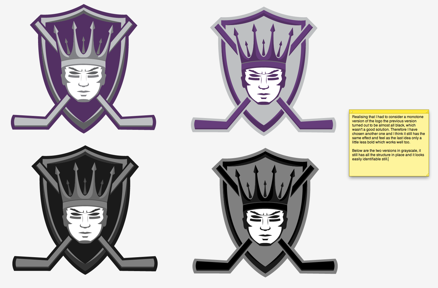
After a while working I still felt like my heart was set on the face design as I thought it was most striking and had the most meaning. Therefore I decided to work more on that idea and develop some more variations and colours:


I feel like I've finally settled on my logo after a lot of thinking. I have gone way over my plan because of this logo. I feel like I've taken way too long on this and need to move on with the rest of the project.
Logos have always been a difficult thing for me as I am a perfectionist when it comes to them, also I've been an avid fan of hockey since I was young and the logo is seen everywhere, so I think that put pressure on me to make it the best I can make it. I'm glad I'm happy with this result too!
I feel I've learned quite a lot from doing this logo. I've never tried designing a sports logo before or tried the style of vector illustrations which form them. From my research I know what I wanted to create a clean yet bold illustration and I think I've done just that, the colours and imagery reflect the royal meaning that I had to project in order to make connections to the town and the bold face, strong imagery suggest an athletic and muscular appeal which connotes the nature of Ice Hockey.
Although I am behind with my project I am really happy with the work I've produced so I'm really excited to get on with the rest of my project!
No comments:
Post a Comment