I want to move on to flyers therefore I have done some research into what I think would look good as an Ice Hockey advertisement.
Ideally these flyers would be handed out by the team/friends/family/around town (everywhere basically!) and therefore really need to focus on selling the team and game. For this I need to involve information regarding the team's practise sessions, prices, times, games etc. I want make sure I catch people's eye with this as it is one of the most valuable pieces of advertisement I would be able to afford.
Another thing worth mentioning is the printing. I would have to consider the fact that semi-gloss will be the best option. Reasons being is that a matte surface tends to make scratch marks very easily and because flyers are designed to fit in pockets/bags without any protection, therefore they would get ruined quite easily. I could use Gloss paper because it looks most like the surface of ice but then again if these flyers are to be held everywhere then I have to consider light glare reflecting off the flyer and putting people off reading it. If I use a semi gloss paper type then I still have the icy feel and look but without the glare and limited scratch marks. Semi-gloss isn't the most durable out of the 3 but flyers are naturally always going to crease/tear somehow just due to people fidgeting with them.
The research I have gathered is quite photographic (I have photos from a Guildford Flames game) and so I will be involving my own photography into the designs. Before I start designing on screen however I need to make sure I have settled on a kit design (still waiting on feedback) because I'll need to photoshop the kit to look like my designs.
This first piece I collected I chose simply because I really love the composition of how the bike and rider are slanted slightly and the text reflect that in the same way. Because Ice Hockey players move fast they require having to twist and turn in different angles all the time and so this might be a nice effect to use. It would reflect the movement and agility of the game. In addition to this I quite like the black and white imagery with a singular piece of orange text and strip make it really stand out. So for example I could have a price or special offer in a solid colour whilst everything else is grayscale. Just a thought.
 |
| Found via Google: http://megadeluxe.com/wp-content/uploads/2012/01/jegou-05.jpg |
I found this one and reminded me of the banner effect I have on my logo which I can reuse in this style. I have used this effect in other designs but this will keep the design consistent, fashionable and modern which will result in more young people feeling encouraged to find out more about it.
When I looked closer I also saw that the banners had a sort of grungy splatter effect I think to reflect the gritty and dirty nature of biking. I could have a similar effect here but maybe ice skating indents.
 |
| Found via Google: http://www.makebetterflyers.com/flyers/mega-bmx-show/ |
I chose this design because of the typical action orientated appeal that it projects. Here we have a player obviously looking like he's celebrating from a goal. if you notice the player is slanted to the right slightly and so the text is doing the same which reflects a good composition and consistency.
I really like the use of different sizes for the text and the biggest sized word is 'IGNITE' which is already a heavy word and creates a lot of impact which I think does well in catching peoples attention.
Just while writing this I realised that the blue light looks like the same spot as where the basketball hoop would be, I think the light reflects the fact this player has just scored a goal and looks like some sort of 'magic' is coming out from it which plays along with the team's name which I quite like. Quite often sports commentators mention the word magic when something extraordinary/skillful just happened.
I definitely think using action shots are a great way of promoting a sport which is fast and physical.
Additionally I like the line going through the word 'IGNITE' as it looks similar to ice which has just been skated over.
 |
| Found via Dribbble: http://dribbble.com/shots/531321-Tourism-Flyer |
Moving onto something with a little more 'grit' I chose this one because I quite liked the use of cropping a photo to see just the legs as I think it creates a lot of movement which would encourage fellow athletes and sports fans to take interest in. The same thing could be applied with ice hockey players legs and skates. It will instantly tell the public that the game is fast and intense. Although I do think it's important to involve the entire body but I found this quite enigmatic. I want people to feel encouraged to check out the team but at the same time feel curious about the game. Ice Hockey isn't a very renowned sport here but I know American Football is becoming more popular now and I think if more people became more aware of Ice Hockey they would really enjoy the game (football fans and ice hockey fans aren't that different).
I quite like the grit shown on the inside of the photo as it represents the mud and dirt you move through when running and so I thought that could be a nice touch (similar to the banner shape on the 2nd flyer in this post).
 |
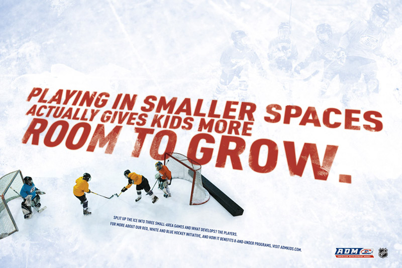
| Found via Google: http://www.hogensondesign.com/2012/03/esp-flyer-designs/ |
This is one of the only few Ice Hockey flyers I saw that I actually liked and so I thought I'd put it in my research. I liked this one for its composition and gritty nature shown in the text. It's as if the text is printed/embedded into the ice which gives a really nice effect I thought. I have pictures of the ice rink in Guildford as a whole and so it is a good design space for large text.
I tend to take interest in text based designs as they say exactly what is needed to be said without having a meaning hiding behind an image and this does just that and so I think maybe this could be used in the same way to promote the team and game. I'm sure other people feel the same about other ads which are heavily text based.
 |
| Found via Google: http://www.periscope.com/Work/view/168/Cross-Ice/947/ |
I thought I wanted to include this piece because of the shape. Bearing in mind this is a banner and not a flyer but I thought this could work just as well as a flyer. The shape suggests a sport to me so without registering the imagery straight off I think the shape gives away the concept anyway which I found to be quite interesting. Also the same shape is used in my logo so this would keep the design consistent throughout. This would catch the eye of other athletes and sports fans as they would recognise the shape from other sports.
 |
| Found via Google: http://shop.mlb.com/product/index.jsp?productId=12364745 |
The blue lines in this one stood out to me because it looks like the ice skate indents on ice and so I thought that could be a nice touch. However it does also look like what it's originally advertising, snowboard marks. But also what I got from this are F1 tracks or racing tracks in general because quite often they have tracks which adopt a very similar shape.
Also again with the simple colour palette with one solid colour standing out. I find it really effective. Although I think this could be better if 'Snowboard' was in blue and it would immediately tell people it's a snowboard event not a race car event.
 |
| Found via Google: http://www.presidiacreative.com/28-inspirational-flyer-designs/ |
This last design I wanted to use because of the composition of shapes and angles. I think it's really effective because it looks modern, signifies the snowboard shape from the curved corners of the boxes and also the text are angled similarly to the dexterity and flips of the extreme sport. I also think the editing of the photography here is really nice as it looks action packed, exciting and fun. Which is definitely a selling point for such an extreme sport and of course the same for Ice Hockey so this idea might be a good idea to take forward. I think the public will recognise an action packed flyer and take interest better than they would take interest in a normal flyer. I really need to focus on making my designs powerful and exciting.
 |
| Found via Google: http://www.stocklayouts.com/images/Blog/ski-snowboard-instructor-marketing-graphic-design.jpg |
Overall I think this research has given me a ground for ideas and I feel like I can try lots of different things whilst staying consistent with my original designs.
The next step for me now is to get to sketching and I will post any more inspiration if I find any.
No comments:
Post a Comment