I’m going to do some
sketches to adapt to my rams head and crown idea. I need to grab some images to
inspire me and give me ideas for this idea, other existing logos for example
and real photos of rams.
First I had a look at some photography for rams and this is what I found:
 |
| Found via Google: http://www.sheppardsoftware.com/content/animals/images/mammals/sheep_c_ram.jpg |
 |
| Found via Google: http://kamloopsnaturalistclub.com/wp-content/uploads/2011/11/ram-with-flare-clolseup.jpg |
 |
| Found via Google: http://www.fotothing.com/photos/f15/f154bffd641baf8becd4ee0957d7f2eb.jpg |
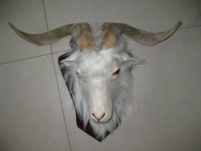 |
| Found via Google: http://mail.heat.net/store/img-large/taxidermy-animal-sheep-ram-head-dall-goat-2-different-designs_250967461143.jpg |
I really like the look
of the horns and I think they could be the main asset to focus on as they as
very distinctive. I could easily try an abstract approach which could involve
the horns in some way as they are a strange shape and pattern. I tried to get some different variations of horn shapes but the most common type are the type shown in the top image, so I think that's the best one to use to make it that much easier to identify it. It appears they can have different colours of fur which patches also in a different colour which I could play around with if it doesn't make it unnecessarily complicated.
I then went on to researching a couple of sports logos involving rams and this is what I found:
 |
| Found via Google: http://sportslogos.net/logo.php?id=2484 |
This logo for the
Fordham Rams are a group of sports teams for the University of Fordham in New
York.
I think the logo looks
nice, it’s clean and bold with suitable colours. I can see from researching a
bit about Fordham university that their logo is already a maroon colour so that
would explain the reasons for the maroon in their sports logo. Additionally the
black is a dominant colour meaning that it symbolises power as it surrounds the
design and fills the shadows in the shapes.
As for the text I
think they have adopted a typical athletic font, similar to the Jersey M24 font
that I used for my previous face logo. This is suitable because it’s used in all sorts
of athletic design, considering the university uses the same logo for all their
sports team it seems suitable to use it as it fits all sport genres. I also
like how they have warped the text to appear over the ram as if dominating the
image which can symbolise a person/character, this appears quite intimidating.
That’s easily doable in Illustrator simply by warping the text. The same
technique I used for the Sovereigns type.
I want to somehow
involve the spring water in the design if it would fit, in a very subtle tone.
I feel the colours inside the horns are swerving, like water would - perhaps something to consider.
 |
| Found via Google: http://cdn.tripwiremagazine.com/wp-content/uploads/2011/11/image327.png |
This design I think is
quite nice, the blue and gold is very similar to the NHL logo for the St.
Blues. Obviously this colour scheme is an important aspect of the city. I think
the blue is used because the city is built right next to the Missouri River and
so I think they wanted to portray the aspect of water, as for the gold I
couldn’t find a meaningful reason as to why they have used that colour but it
is known to run well with navy blue and therefore that’s why I think they have
used it, this might be the suitable colour scheme for my logo as I want to
portray a water aspect and royalty which both blue and gold connote.
I also quite like the
‘R’ in the type, as the curve in the top of the ‘R’ comes around like the horn on a ram, I think that’s a clever piece of design and even if it didn’t have
any imagery other than the type it’s still easily legible to see what it means.
As other sports logos
they have adopted the strong and bold typefaces in order to project a masculine
feel which are also sheared to give that italic look which connotes speed and power.
No comments:
Post a Comment